
If you haven’t experienced her mischievous smile yet, then let me explain the mystery behind it. Mona Lisa is very moody. When you look at her the first time, she smiles at you :) and after some time the smile vanishes… But don’t give up; keep staring at her face and she’ll smile again for a moment.
How this is possible? Almost everybody who sees the portrait raises this question and, no doubt, you can find countless explanations for her animated and ambiguous expression. However, these explanations are not very convincing. After reading various views and explanations, I think it’s important to put down a more concrete explanation in place.
Once again, the search for the most winning explanation ends at ’Human Vision System’. But this time the logic knocks a different door (no “where” or “what” systems like in the previous article).
Using Mona Lisa as an example, we are going to explore the way we look at things. The human eye has its own method for seeing; it always splits vision into two distinct regions:
1. Fovea region
2. Peripheral region
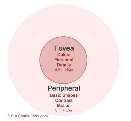
Fovea Region
This is the central spot of your vision, from where your eye collects the most detailed information. This is the area from where the eye can decode perfect colors, read fine print and figure out the fine details. In other words, the object on which you want to focus your vision will be in fovea region, for example, currently the text you are reading is in the fovea region of your vision.
Fovea region works best with high spatial frequency ranges.
Peripheral Region
The area in the surroundings of Fovea comes under Peripheral Region. From this region, eye can’t pick detailed information. Only motion, contrast and low level details (about color, texture and shape) can be seen from this region, for example, while reading this sentence you can see someone moving just few steps away from your desk, but you can’t recognize the person. This is because that person is moving in your peripheral region.
Peripheral region works best with low spatial frequency ranges.
For better understanding, take a look at the following image.
Now let’s talk to Mona Lisa about fovea and peripheral :)
When a person is looking at someone, for the most of the time the eyes are focused on the other person's eyes, which means that his/her eyes are in the scope of our fovea region and the remaining part of face is in peripheral region.
Therefore, when a person's center of vision is on Mona Lisa's eyes, his less accurate peripheral vision is on the surroundings including her mouth. And because peripheral vision is not capable of rendering details, it readily picks up shadows from Mona Lisa's cheekbones. These shadows enhance the curvature near the mouth giving the impression that Mona Lisa is smiling. This can be explained by the fact that her smile is almost entirely in low spatial frequencies and that the peripheral vision is sensitive towards this.
If you move your focus to her mouth, your fovea vision shows more interest in details which are present in high spatial frequencies. These details don’t render shadows (low spatial frequencies) with the same prominence. This is the reason why her smile seems to fade away. :(
So, every time you look at the painting, the new combination of Fovea and Peripheral changes the degree of her smile and you feel the dynamism in her smile.
Following three images show her face to highlight lowest (left), low (middle), and high (right) spatial frequencies.

So, Mona keep smiling, but it’s no more mischievous for us :)
I assume that after reading this article, you’ll be highly interested in knowing more about “Human Vision System”.
All the credit for discovering this science – which can unfold the mystery behind the canvas – goes to the Professor Livingstone. She is working on how cells in the visual system process information and is trying to find a new relation between art and science.

¶ 3:28 AM 6 Comments
The definition of effectiveness may differ from person to person and sometimes it is also industry dependent. But generally speaking an effective visual should be like a shop with a very attractive window display to drive your steps into the shop; and once you are inside, you are also extended attractive offers that encourage you stay there for a long time. And finally, you leave that shop with a handful of bags. :)
But in this flashy generation of digital content presentation, most designs are like shops which have very good window displays, but you feel like stepping out the minute you enter. The designs seem to lack that ‘something’ that would hold you there for a while.
In short, a visual – to be considered effective – should contain the following two attributes:
- The visual should be attention grabbing for the viewer.
- The visual should hold the attention of the viewer for a decent period of time.
Both of the above mentioned attributes should be in perfect synergy in a visual. Making the visual attractive addresses the first objective, and adopting a good architecture of information (IA – information architecture) and visual flow takes care of the second purpose.
I think this is sufficient background for the following reading, so let’s move to the real stuff :) ….. but let me make it clear that I am not going to explain any Mantra on how to make effective visuals . I’ll just explain how things work in the background when someone looks at the visual. By internalizing the grass root level understanding of how human mind interprets visual cues, you can actually develop your own approach for effective design.
One interesting fact about this article is that I am not going to build it around the aesthetics of Art & Design. It may seem surprising that we’ll not consider the aesthetics aspects of Art & Design while discussing about the effective design. We’ll stick to the “Grass Root Level”, as I mentioned in the previous paragraph. We’ll understand biological facts on how the most civilized and intellectual animal (Human) uses its basic instinct to render visuals. Interesting, isn’t it?
The whole story starts and ends with “Human Vision System”. Human Vision System (going forward I’ll refer to this as “HVS”) tells us how cells in the visual system (which are part of the human mind) process information. A parallel processing of different kinds of visual information (like form, color, depth, and movement) happens very smartly and systematically in the human mind.
For visual interpretation, two sub systems works in background. These are the:
- Where subsystem
- What subsystem
“Where” is responsible for the ultra fast visual snatch but “what” manipulates the finer points. Each vision system is made of different types of neurons. Therefore, the ways in which they process information gathered by the retina of our eyes are different. Let’s dig deeper into the details now … the primary task of attracting the viewer is actually done by the “where” system while “what” holds the user on the same spot for a long time.
All this happens very transparently each time we look at a visual. So, once you are aware how the where and what elements actually work … you can control the nervous system of your viewer.
“Where”
“Where” is the subsystem that is actually very sensitive to motion, high contrast, directions, edges and shapes. This is a very primitive kind of subsystem in “HVS” and basically it is a protective system. The primary task of “Where” is to ensure the survival of the creature; so it always keep reading the surroundings for motion, high contrast, directions, edges and shapes to focus the attention on them. After that, the other systems or subsystems take over, while the “where” system keeps looking for any other changes in the surrounding. So, the “where” subsystem grabs and looses attention very quickly.
The “where” system is completely color blind, as it works on contrast only. It doesn’t show any kind of sensitivity to texture and details. This seems to be valid because of two reasons –
- It is not programmed to do so. :)
- It is not possible to render such details because of its super quick nature.
How “where” works practically
Just imagine that while sitting in a garden, you saw something in motion in the bush near you. This will trigger your "where" subsystem and turn your attention to that area quickly to examine any danger. Your "where" raises an alarm in your mind and you give attention to that motion (which might be a snake or some other harmful animal). Because "where" can't examine the details for color, texture and resemblance, so other systems take over from here to further investigate the threat and "where" goes back to its work of collecting new visual inputs.

In the image above, it is quite obvious that the first white circle in the image above grabs the attention very quickly – because of its high contrast with background. And for this the credit must go to the “where” subsystem. :)
Here is one more image:

I need not mention that, again, the “where” subsystem has been triggered by this image. But the image can’t hold your attention for a long time because “where” looses interest very quickly. On the other hand, this image doesn’t have enough elements to stimulate the other systems like “what”.
So, in a visual design where you want the viewer’s attention, you need to trigger his/her “where” system by placing “where” type elements. However, too much of “where” can spoil your design. In effect, the “where” element should be present in a logical balance with “what”.
“Where” in short
- Very primitive type of survival system
- Sensitive to motion, high contrast, directions and shapes
- Initiates and terminates very quickly
- Does not process any color, texture and detail
“What”
The “what” subsystem is not as primitive as “where”. It came into existence after “where” in the evolution cycle. Mostly “what” works in a linear fashion and follows “where’s” inputs to render the areas for further details.
Unlikely the previous system, “what” is highly sensitive to color, texture and details. It works the best with low contrast visuals. “What” takes time to trigger, but once this subsystem is triggered, it stays activated for a long time to process the details. While looking at the details, it tries to correlate them with the memorized details, and also sends the new information to the other subsystems to make it permanent.

This image above activates your “what” system by using colors, texture and soft curves. But your attention may wander because this image is very much “what” in nature. By balancing it with a perfect amount of “where” factor you can actually achieve the goal of holding on to the viewer’s attention.
“What” in short
- A detail-oriented system
- Sensitive to color, texture and details
- Takes time to terminate and stays activated for a long period
- Can be terminated by a new and stronger “where” signal
Where + What = Effective Visual

Because “where” is normally followed by “what”, so when we are adding “where” type elements, we must add enough amount of “what”. This is done to ensure that the attention which has been grabbed by the “where” element can be held by the “what” element. Too much of any one of them can wipe out the overall effectiveness of a visual.
I hope this article will help you to enhance the effectiveness when you design something next time. However, this is not the only Mantra for effective visuals. There are many other factors involved that we need to take care of.
one interesting thing which I haven’t covered in this article is the behavior of text in visuals as per “Human Vision System”. I’ll post a detailed Blog on the same soon.
I would really like to mention the name of 2 forces behind this article -
Manish Sahajwani - for motivating me to start this Blog ( actually I should say: by pressurizing me, as he used to ask every day J – “Hay Harsh …. Have u posted anything?????”
Shamik Chowdhury – for providing the fantastic enhancement to this article.

